3D 旋转木马是CSS中常见的特效之一,旋转木马可以有多种方法实现,这里我使用纯CSS实现这种动画的效果。
简要介绍一下重点
transform: rotateY(60deg) translateZ(300px);
这是必须先旋转后 沿着z轴移动,不然会错乱,translateZ是沿着Z轴移动,其值越大,我们看见的图像就越大。
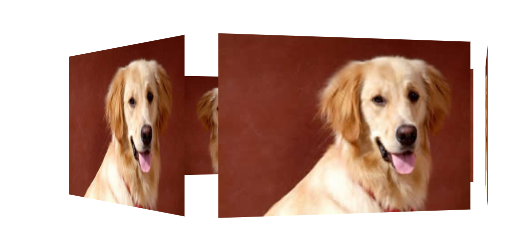
 1 <!DOCTYPE html>
 2 <html lang="en">
 3
 4 <head>
 5     <meta charset="UTF-8">
 6     <meta name="viewport" content="width=device-width, initial-scale=1.0">
 7     <title>Document</title>
 8     <style>
 9         body {
10             perspective: 1000px;
11         }
12
13         section {
14             position: relative;
15             width: 300px;
16             height: 200px;
17             margin: 150px auto;
18             transform-style: preserve-3d;
19             animation: roate 10s linear infinite;
20         }
21
22         section div {
23             position: absolute;
24             top: 0;
25             left: 0;
26             width: 100%;
27             height: 100%;
28             /* background: url(media/dog.jpg) no-repeat; */
29             background-color: yellow;
30         }
31
32         section:hover {
33             animation-play-state: paused;
34         }
35
36         @keyframes roate {
37             0% {
38                 transform: rotateY(0);
39             }
40             100% {
41                 transform: rotateY(360deg);
42             }
43         }
44
45         section div:nth-child(1) {
46             transform: rotateY(0) translateZ(300px);
47             /* 可以添加自己想添加的图片 这里用背景色pink代替 下面都一样*/
48             background-color: pink;
49         }
50
51         section div:nth-child(2) {
52             transform: rotateY(60deg) translateZ(300px);
53         }
54
55         section div:nth-child(3) {
56             transform: rotateY(120deg) translateZ(300px);
57         }
58
59         section div:nth-child(4) {
60             transform: rotateY(180deg) translateZ(300px);
61         }
62
63         section div:nth-child(5) {
64             transform: rotateY(240deg) translateZ(300px);
65         }
66
67         section div:nth-child(6) {
68             transform: rotateY(300deg) translateZ(300px);
69         }
70     </style>
71 </head>
72
73 <body>
74     <section>
75         <div></div>
76         <div></div>
77         <div></div>
78         <div></div>
79         <div></div>
80         <div></div>
81     </section>
82 </body>
83
84 </html>
1.《web CSS3 实现3D旋转木马》援引自互联网,旨在传递更多网络信息知识,仅代表作者本人观点,与本网站无关,侵删请联系页脚下方联系方式。
2.《web CSS3 实现3D旋转木马》仅供读者参考,本网站未对该内容进行证实,对其原创性、真实性、完整性、及时性不作任何保证。
3.文章转载时请保留本站内容来源地址,https://www.cxvn.com/study/26742.html